Zach’s ugly mug (his face) Zach Leatherman

If the Menu Fitts, We Must Acquit

February 15, 2010

One of the first things you’ll learn when diving into a self-taught course on usability is the hugely popular Fitts’s Law. In a nutshell, Fitts’s Law tries to predict the time needed to move to a “target area” (usually a link, menu, button, or form element) as a function of the distance to the element and its size. The bigger/closer the element, the faster a user can move to it.

Now, upon discovering myself a newly minted Mac OS convert from the hugely popular World of Windows, I quickly discovered that the application menus (File, Edit, etc) were one of the glaring differences I’d have to adjust to. Mac OS had all menus separated from the application window, all the way at the top of the screen. Coming from the Windows environment, this seemed unintuitive. But after reading more about Fitts’s Law, I discovered the reasoning: the edges of the screen are treated as an infinite height or width! Which is just a way of modifying the Fitts’s Law to say: the easiest things to click on are at the edges of the screen. That’s why the close icon or the Start Menu is so easy to access on Windows, and why the Application Menu is at the top of the screen in Mac OS.

We know about Fitts’s Law, but why aren’t we applying it to our web applications? Why aren’t we using the power of infinite height/width to help out on our designs? It seems like this crucial usability law has been overlooked on the web, and without good reason. Let’s look at a few applications that get it wrong (of course, in my humble opinion).
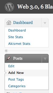
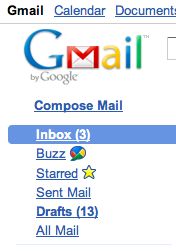
Wordpress Admin MenuGoogle Mail MenuGoogle Reader Menu

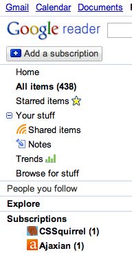
All of these screenshots were taken from 100% width designs, with no real reason not to incorporate the ideas behind Fitts’s Law into the menuing system. At first glance when I brought up Google Reader, I was excited. The hover behavior appeared when the mouse cursor was positioned at the very far left of the screen, but was disappointed to discover that the although the hover background color had changed, the entire hover target was not clickable.

Naturally, I decided to make a test of my own, to test which web browsers allowed Fitts’s Law Menus. The test case encompassed both left and bottom aligned menus, for completeness. A top menu was excluded, given that the top of the screen is reserved for browser chrome or application menuing. A right menu was also excluded as the right portion of the screen is reserved for the page scrollbar (which is the easiest scrollbar to manipulate with your mouse, per the same rules).

Also, on the Mac OS 10.6 and Windows XP operating systems, a Fitts’s Law Menu at the bottom of the screen is not possible, given that the Dock and Taskbar in these operating systems occupy at least a 4 pixel trough of the bottom-most space on the monitor, even as a hover target in “auto-hide” mode. Everyone is fighting over these crucial and very useful edge pixels.

To test whether or not this behavior is working correctly, maximize your browser window and move the cursor as far left on the screen as possible, but still over the menu. If the links are still clickable, congratulations, your browser works!

View the Demo / Test Page for the Fitts’s Law Menu

Compatibility Table

Browser Operating System Left Menu Bottom Menu Status Bar Detail
Internet Explorer 8 Windows XP no no yes IE8 has a small 3 pixel border on the left and right of each window.
Internet Explorer 7 Windows XP no no yes IE7 has a small 3 pixel border on the left and right of each window.
Internet Explorer 6 Windows XP no no yes IE6 has a small 3 pixel border on the left and right of each window.
Google Chrome Windows XP and Mac OS 10.6 yes no no
Mozilla Firefox 3.5 and 3.6 Windows XP and Mac OS 10.6 yes no yes
Safari 4.0.4 Windows XP and Mac OS 10.6 yes no no

The full screen mode of each individual browser was considered outside the scope of this study.

Conclusion

We should stand on the shoulders of giants and reuse the usability studies already completed on software that has gone before us. The left side of the browser window is the best place to utilize Fitts’s Law, and we should move our left-aligned menus on fluid width designs to occupy the space flush with the window’s edge to increase the speed at which those menus will be accessible by users. Having an infinite width menu is a big click target to hit.


< Newer
Internet Explorer Array.sort Unreliable
Older >
CSS 3 Text: A Tale of writing-mode Woe

Zach Leatherman IndieWeb Avatar for https://zachleat.com/is a builder for the web at IndieWeb Avatar for https://cloudcannon.com/CloudCannon. He is the creator and maintainer of IndieWeb Avatar for https://www.11ty.devEleventy (11ty), an award-winning open source site generator. At one point he became entirely too fixated on web fonts. He has given 79 talks in nine different countries at events like Beyond Tellerrand, Smashing Conference, Jamstack Conf, CSSConf, and The White House. Formerly part of Netlify, Filament Group, NEJS CONF, and NebraskaJS. Learn more about Zach »

8 Comments
  1. James Padolsey Disqus

    16 Feb 2010
    Great post Zach! And an excellent point!FWIW, Opera (I tested v. 10) seems to be compatible with this "law" too.
  2. Jordan Disqus

    17 Feb 2010
    IE8 (fullscreen mode) on Win7/Server 2008 R2 works on both cases (disabling the status bar).Chromium (fullscreen mode) on Win7/Server 2008 R2 said some mean words and didn't work in either case.After I went and did this I saw that you noted the fullscreen mode was out of scope, but I thought I'd let you know the results anyway.Thanks for the write-up. It's a very interesting thought - definitely something to consider when designing navigation. Multi-monitor situations are another interesting case for this, but I'm guessing isn't common enough to stress over.
  3. Daniel Shaw Disqus

    17 Feb 2010
    Great post Zach. Very interesting observations.I have two monitors and have one to the left of my main browsing window. Interesting how that infinite edge disappears when I have to consciously stop in that space.
  4. Zach Leatherman Disqus

    20 Feb 2010
    Thanks guys.Also, another thought: the "infinite edge" case doesn't quite apply for touchscreen interfaces.
  5. Arne Stephensson Disqus

    23 Apr 2010
    In the examples you gave, the interface don't reach exactly to the left edge of the screen because the lack of whitespace would make things UGLY. Whitespace, like Fitt's Overrated Law, is also a huge usability factor.There are two things you're placing at odds: the speed at which you can slam your cursor against the left edge of the screen, and the speed at which your eye can actually make out text better because of proper whitespace.I don't think the two things have to be placed at odds, but if you say they have to be, then I'd argue that adequate whitespace (as shown in the Wordpress and Gmail menus) is preferred over things like Fitt's Law.I admire gratuitous use of whitespace in application and website design. I don't think most people are out to turn their users into the most efficient robots possible, shaving milliseconds off of the time that people can click the Spam folder in Gmail. Don't be such an engineer. Aesthetics is a huge part of usability. Your demo proves a point but... it's ugly. Fitt's Law might apply to more labor-intensive interfaces (like the menus at the top of the screen in Mac OS X, which are constantly being accessed), but when an application is just one of many, or when (as in your demo) it's just a blog with a few links, I think whitespace is a more important usability goal than Fitt's Law.
  6. Zach Leatherman Disqus

    06 May 2010
    You can still have whitespace and an attractive looking click target. The hover background doesn't necessarily need to be 1:1 with the click target. Won't apologize for being an engineer though :)
  7. Dr. Curiosity Disqus

    25 Oct 2010
    Hi there, I just randomly found this while looking for other usability issues regarding Fitts' Law on the Mac.While your flush-left menu is an interesting idea, it completely fails to be any more useful than any other left-hand menu with my computer setup. To make better use of the real estate on a display that's considerably wider than it is high, I have Chrome set to display my tabs... you guessed it, along the left-hand side of the browser. Even when it's in full-screen mode with the tabs hidden, I can't rely on hitting the edge for menu selection because I'm browsing on my right-hand monitor. Going too far left puts me on my laptop screen where the coding and the console windows live.Another thing I'd note is that the menu targets could be more immediately visible. On first seeing them, I'd assume that only the text was clickable. Moving my cursor up to "About Zach Leatherman", I found myself distracted by the fact that there's some clear space turning black under my cursor before I've even reached my intended target, or anything that looks like a target.With things that look like buttons (or even bordered boxes), there come user affordances. We expect that something might react when we cross into or over a bordered region. When all there is between areas of white space is a faint grey line, it comes as a surprise.Recall also that Fitts' Law has a perceptual feedback basis, and having a large target isn't so useful if it isn't perceivable as a large target. If you find that something doesn't meet your target expectations, it can slow you down - for example, I've seen sites where the background colour of a link changes when you hover over the region it's in, but only the text itself is actually clickable.In any case, I hope my unsolicited feedback was useful, or at least interesting. All the best!
  8. Thomas Hendrickx Disqus

    10 Jan 2014
    Hi, In search of more information about Fitts law I came accros this post.I found it rather interesting to find out that one of the examples that you used still does not implement the use of the corners and borders (gmail). For a course I’m following, Human Computer Interaction, we had to read a paper and this post reminded me about that. It describes a new model to unite Fitts and Hick-Hyman laws together (I have a link at the bottom).They stated that the use of the Hick-Hyman law is rather low in determining the efficiency of a menu (like the ones in your example). They also incorporated a way to implement the experience of the user. By combining all that the proposed model can predict the efficiency of a menu better (higher R²) than models it was tested against.However they did say that the way they measured experience still needed some more development. Certain menu designs like the Bederson’s Fisheye menu, which dynamicly adjust the location and size of items are harder to model than anticipated.All in all an interesting article which I could recommend.Thomashttp://ir.canterbury.ac.nz/...
Shamelessly plug your related post

These are webmentions via the IndieWeb and webmention.io.

Sharing on social media?

This is what will show up when you share this post on Social Media:

How did you do this? I automated my Open Graph images. (Peer behind the curtain at the test page)