Obnoxiously Readable Responsive Text with Viewport Units
Ever since I created BigText over seven years ago, I’ve been a little bit obsessed with beautifully large text. Unfortunately my own blog had post titles that were—to be honest—a little bland. I wanted to spice it up a bit and move from fixed text sizes to dynamic text that grows with the viewport size. I’ve seen many iterations of this approach using resize handlers in JavaScript:
- BigText, which uses JavaScript to find the right text size automatically (it’s a bit expensive and slow).
- FitText.js (from Dave Rupert) uses a developer-specified scaling factor to linearly scale the text size for you (fast but requires configuration).
- Another popular one is FlowType.JS—the concept is very similar.
There have been other incarnations of this style of JavaScript text resizing. But as far as I can tell, we had the option to retire all of these approaches when Viewport Units were well supported in 2012! If CSS can do the job, do the job in CSS. Delete your redundant JavaScripts, everyone!
I can already anticipate the first retort to post: the JavaScript plugins can resize to element size and not viewport size! Okay—really this is just another vote for container queries. We can manage this with CSS—it just requires additional, annoyingly attentive care to maintain code for the boundaries at which our text should be resizable and when it should be fixed. But—it’s still better than a JavaScript resize-event handler (in my humble opinion). If we know where our components live in our layout, we can just adjust our Viewport Unit values accordingly to fake a sort of Container Unit.
Example
The current layout specifications for my own blog post layout are:
- Baseline is 100% fluid width.
- Content has a
max-width: 589px(31ematfont-size: 19px) and maintains thismax-widtheven when adding the right rail.
(This layout specification reminds me of sizes from srcset with responsive images, hmm…)
This is a pretty simple example—we have two boundaries: the breakpoint at which we’ll switch to using Viewport Units, and an upper bound when we hit the content max-width (at 589px).
You can customize breakpoints and minimum font-size to your use case:
#demo-1 {
    /* Minimum font-size */
    font-size: 20px;
}

/* Arbitrary minimum breakpoint */
/* Transition from 20px minimum font-size to vw using this formula: */
@media (min-width: 320px) {
    #demo-1 {
        /* ( Minimum font-size / Breakpoint ) ✕ 100 */
        /* ( 20px / 320px ) ✕ 100 = 6.25vw */
        font-size: 6.25vw;
    }
}

/* Content max-width breakpoint */
/* Transition from vw to maximum font-size using this formula: */
@media (min-width: 589px) {
    #demo-1 {
        /* Breakpoint ✕ ( Viewport Units / 100 ) */
        /* 589px ✕ ( 6.25vw / 100 ) = 36.8125px */
        font-size: 36.8125px;
    }
}
Caveat: I’m using px here in a few places where I’d normally use ems or rems, to make the example code easier to read.
Formulas
Transition from Fixed Minimum font-size to Viewport Units
This is used in the above example at the 320px breakpoint.
Viewport Units = ( font-size (px) / Breakpoint (px) ) ✕ 100Transition from Viewport Units to Fixed Maximum font-size
This is used in the above example at the 589px breakpoint.
font-size (px) = Breakpoint (px) ✕ ( Viewport Units / 100 )After you have your pixels, of course you can convert to rem or em as desired.
Smaller Delta
If you want the text to grow or shrink at a reduced rate, you can use calc to sum a vw unit with a fixed CSS unit (like px or em)—but getting your boundaries aligned properly is a bit more difficult and beyond the scope of what I’d like to cover here. An exercise left up to the reader 😇.
Update on 2018 May 25: There is an incredible article written by Florens Verschelde about The Math of CSS Locks which covers this exact subject. Seriously, go read it—it’s amazing.
Twin Props
#demo-1 {
    /* Minimum font-size */
    font-size: 20px;
    font-size: 6.25vw;
}
I’ve seen some developers suggest forgoing the minimum media query altogether with the above code. This is probably fine but I don’t really like that an unbounded minimum font-size could quickly become unreadable at super small breakpoints. Get on that smart watch, y’all.
Bikeshedding a New Unit
It does make me wonder how container queries (or similar) might work with Viewport Units. I’m starting to see now that the addition of a future Container Unit might be warranted to simplify the above code.
#demo-2 {
    font-size: 20px;
}
@media (min-width: 320px) {
    #demo-2 {
        /* Beware: `cw` is not a real unit */
        font-size: 6.25cw;
    }
}
This would alleviate the need for the second breakpoint altogether, as the font-size would be determined by the size of an arbitrary container, which already has an upper bound max-width on it.
Anyway
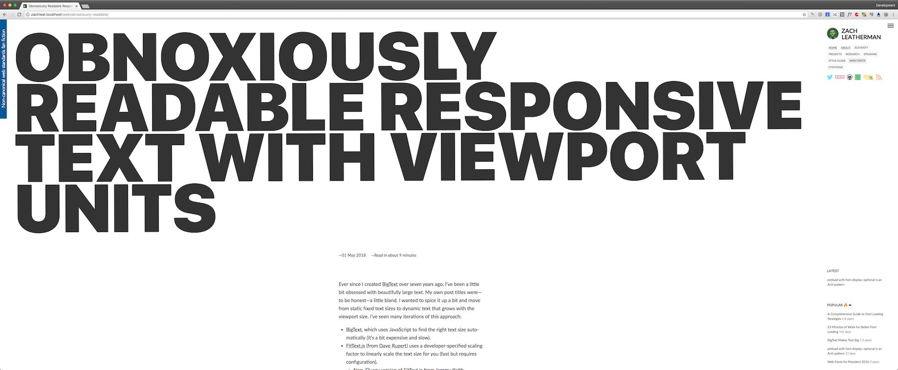
All of this build-up is really just to say that I made all my blog post titles huge and it makes me really happy. I’m using Viewport Units with a minimum boundary only 😎.
If your screen is wide enough (perhaps—say—a viewport size of 3440px), you can probably read them from space:

This is likely just the beginning of a long string of changes I’ll make to the super-wide layout for my blog.
Update
One hefty drawback to this approach (using only vw units to scale text) noted by Andrew Romanov is that the text no longer zooms appropriately with page zoom! He proposes using calc with a combination of fixed and viewport units for at least some text zooming. Read the The Math of CSS Locks for more on that approach.


